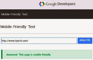
With the increasing usage of mobile devices for internet access, Google is now focusing more on how web pages shows up on mobile screen. In the recent “mobile search” update, Google will be using a new metric “mobile friendliness” to determine the page ranking use in delivering search results to mobile devices.
Google had announced earlier that it would be giving preference to sites that are mobile friendly by adding a label next to the search results on mobile devices to give a visual alert to users.
See Also: How to optimize your blog for better search ranking
See Also: How to optimize your blog for better search ranking
But with this latest update, mobile-friendliness has gone beyond visual alerts to influencing page ranking in search results. This has been interpreted in many quarters as Google’s subtle push for developers to building mobile-friendly sites.
According to the company, “The mobile-friendly update will boost the ranking of mobile friendly pages in mobile search results worldwide”. This means that sites that are considered mobile-friendly will rank higher in search results than those that do not comply.
How to make your site mobile friendly for Google search
1. When opened on a mobile device, the content of the site should be readable without zooming.
2. The content should be scaled to fit on mobile screen without scrolling horizontally.
3. Clickable links should have a generous space between them for easy tapping of the desired link. Fat fingers, they say, loves white spaces.
4. Avoid contents that requires Flash Player, rather update to the more modern iframe embed method mostly used by modern video hosting sites.
5. Use responsive web design. With tools such as Google Analytics, you can get a breakdown of which mobile device or browsers mostly favored by your traffic sources. Building a core content of your site on script may frustrate users of lower end browsers especially with unresponsive plug-ins.
6. Enclose your image inside a div tag whose width is set to the percentage of the screen instead of static pixel size. Example, instead of
<img scr=”a href…/ityunit.png” width=”680” height=”520”> (which may cause overlapping image on smaller screen,
Use instead
<div style=”width: 80%;”>
<img scr=” a href…/ityunit.png” style=”width: 80%;>
</div>
What to do if your site is not mobile-friendly (at least according to the test)
Before you carry out the recommendations dish out by the Google team, first of all make sure you have set your mobile viewport.
To set mobile viewport, copy and paste this code into the header of your HTML page (and any other page you want to make mobile-friendly).
<meta name=”viewport” content=”width=device-width, initial-scale=1”>
Save the template and retry the test
However, if your site is heavily dependent on the embedded video especially those with the “object tag” (for Adobe Flash Player), you need not fear as the page ranking is just for the page and not for the entire site. Another more mobile-friendly page on your site may still rank up traffic to your site from Google search.


